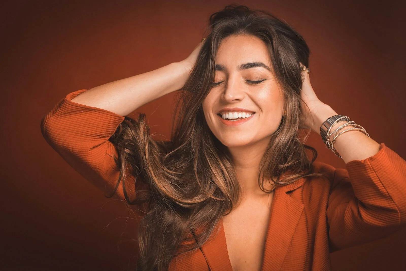
Why Balayage Looks Different on Everyone
Balayage is one of the most requested color services in any salon. It is also one of the most misunderstood — not because the technique is complex, but because the result is never the same twice. Someone saves a photo. The appointment goes well. And then, standing at the mirror, the result looks nothing like what they brought in.
That gap is not a mistake. It is how the technique is designed to work.
The result that looks most like you isn't in a saved photo — it's built around your hair, your depth, and the way it moves.
The Canvas Always Comes First
Before a colorist picks up a brush, the outcome has already been partially written. Natural depth, color history, porosity, and the hair’s current condition all shape how lightener behaves — how quickly it lifts, how evenly it distributes, and how much warmth it leaves behind.
Hair at a level 4 — a medium brown — contains a high concentration of red and yellow underlying pigment. Lightener has to work through that pigment before it reaches the pale or ash tones common in many inspiration photos. Moving too quickly through that process, or attempting to reach a target level in a single session, typically compromises the hair’s structural integrity rather than improving the result. A client at level 7 — a dark golden blonde — starts from a position where the lift occurs faster and more evenly, producing a brighter result with less processing time.
This is not a flaw in the technique. It is an accurate description of how hair responds to chemistry. Balayage does not override the starting point. It works within it.
Read
What Makes Balayage Last Longer
Placement Is Designed for the Hair in Front of the Colorist
Where the lightness lands is not a universal formula — it is a series of decisions made for a specific head of hair. Density, texture, how the hair falls when dry, and where natural light hits the face all determine where each stroke begins, how wide it is drawn, and how far down the strand it extends.
Fine hair and thick hair require entirely different approaches. On fine hair, a moderate amount of lightened sections reads as significantly brighter overall, because the ratio of light to dark shifts easily. On thick hair, achieving the same visual impression requires more saturation — more sections, more coverage — and even then, the result tends to read as dimensional rather than dramatically lighter. Neither outcome is wrong. They are correct for what they were designed around.
Haircut plays a role as well. Layers affect how color moves and where it surfaces. A blunt cut and a heavily layered cut will distribute the same placement differently when the hair falls naturally. The colorist is accounting for all of this before the first section is taken. The photograph the client brought in was designed for a different hair type, by a different colorist, under different conditions. It was never meant to be replicated exactly.
Read
Balayage in NYC: Effortless, Lived-In Hair Color by a Master Colorist
Inspiration Photos Are a Language, Not a Blueprint
The most productive use of a reference image is not as a replication target but as a communication tool. What the photo conveys — warm versus cool, high contrast versus barely there, brightness concentrated at the ends versus woven throughout — is what matters. That is the vocabulary of the consultation.
When a client points to a photo, an experienced colorist is translating it: what draws you to this image? Is it the softness? The way the light seems to exist inside the hair rather than sitting on top of it? The absence of visible grow-out? Those questions locate the actual intention behind the image — and intention is what transfers between clients, because it does not depend on hair type or starting level.
Read
Balayage vs. Highlights: Which Is Better for Low-Maintenance Color?
What It Means for a Result to Look Like You
The measure of a well-executed balayage is not how closely it resembles a saved image. It is whether the color looks like it grew that way — whether the lightness and dimension feel native to the hair rather than placed on top of it.
That quality does not happen by accident. It is the result of a colorist who reads the canvas before touching it, who understands the natural growth pattern, how the base and the lightened sections will coexist over the following months, and how the color will evolve between appointments. The craft is not in the application alone. It is in the thinking that precedes it.
The result that looks most like you is never the one in the photo. It is the one built specifically for you.
Why Consistency Isn’t the Goal
One of the most common misconceptions about balayage is that it should produce a consistent, repeatable result from one client to the next. In reality, the opposite is true. The strength of the technique is its adaptability — its ability to match the specific hair in front of the colorist rather than forcing every client into the same visual outcome.
Consistency in balayage does not mean identical results. It means a consistent standard of decision-making: reading the canvas accurately, placing lightness intentionally, and designing a result that evolves naturally over time. When that standard is applied, the outcome always feels right — even though it never looks the same.
Effortless Color For The Real You.